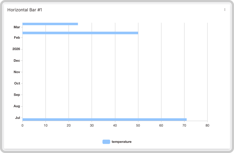
Horizontal Bar Widget
Charts are a powerful way to visualize your data and look for insights. You can customize colors, apply Formula, decide whether bars are stacked, and configure other visual options.
This widget also accepts features such as metadata and groups, which can be set in your variable data.
1. 'Data Sources' Field
This field allows you to set the device and variable that will be used in this widget.
Editing Variable Options
Click on the cog icon next to a variable to edit its options, such as formulas or color. Click on the close icon to remove that variable from the widget’s data.
Dashboard Types
The available options in the Data Sources field depend on whether you are using a normal dashboard or a blueprint dashboard.
1.1 'Data Sources' for Normal Dashboards
From the Data Sources option on the right‑hand menu, select one device from your list of devices and then choose the variable that contains the data.
1.2 'Data Sources' for Blueprint Dashboards
From the Data Sources option on the right‑hand menu, add a Blueprint device and input the name of the variable that holds the information. When using a Blueprint dashboard, the field Variable will list variables to be picked using the currently selected blueprint device.
2. X-axis and Y-axis
In the horizontal bar chart widget you can customize how data is displayed on both axes.
2.1 X‑axis
By default, the X‑axis shows the time of each value, and you can set a custom time range. If you need to group data that does not share the same timestamp, select a variable that contains the grouping key; all values will then be grouped by groups.
You can also define the X‑axis time range dynamically using another variable’s metadata:
{
  "variable": "time_range",
  "value": "Any value",
  "metadata": {
    "start_date": "2021-06-17T00:00:00.000Z",
    "end_date": "2021-06-18T00:00:00.000Z"
  }
}
The start_date and end_date must be in ISO 8601 format.
2.2 Y‑axis
On the horizontal axis you can adjust scaling behavior, apply metric prefixes or abbreviations, change the step value (the distance between ticks), and more. By default the widget automatically selects an appropriate scale for your data; manual adjustments are only needed if you have specific requirements.
3. Filtering Data
You can pre‑set date filters that will be shown when the widget loads. Filters can be expressed in minutes, hours, days, weeks, months, or a custom range chosen from a calendar picker.
4. Increasing performance
For charts with a large number of data points, enable the Aggregate feature to improve widget performance and make the data easier to visualize. Learn more about the Aggregate feature.