Calendar Heatmap Widget
The Calendar Heatmap widget renders a single variable as a calendar-style grid: hours of the day as rows and days, weekdays, or weeks as columns. Each cell is colored by the aggregated value of the records that fall inside it, making time patterns easy to spot, like a machine that always runs hot in the afternoon or anomalies that cluster on weekends.
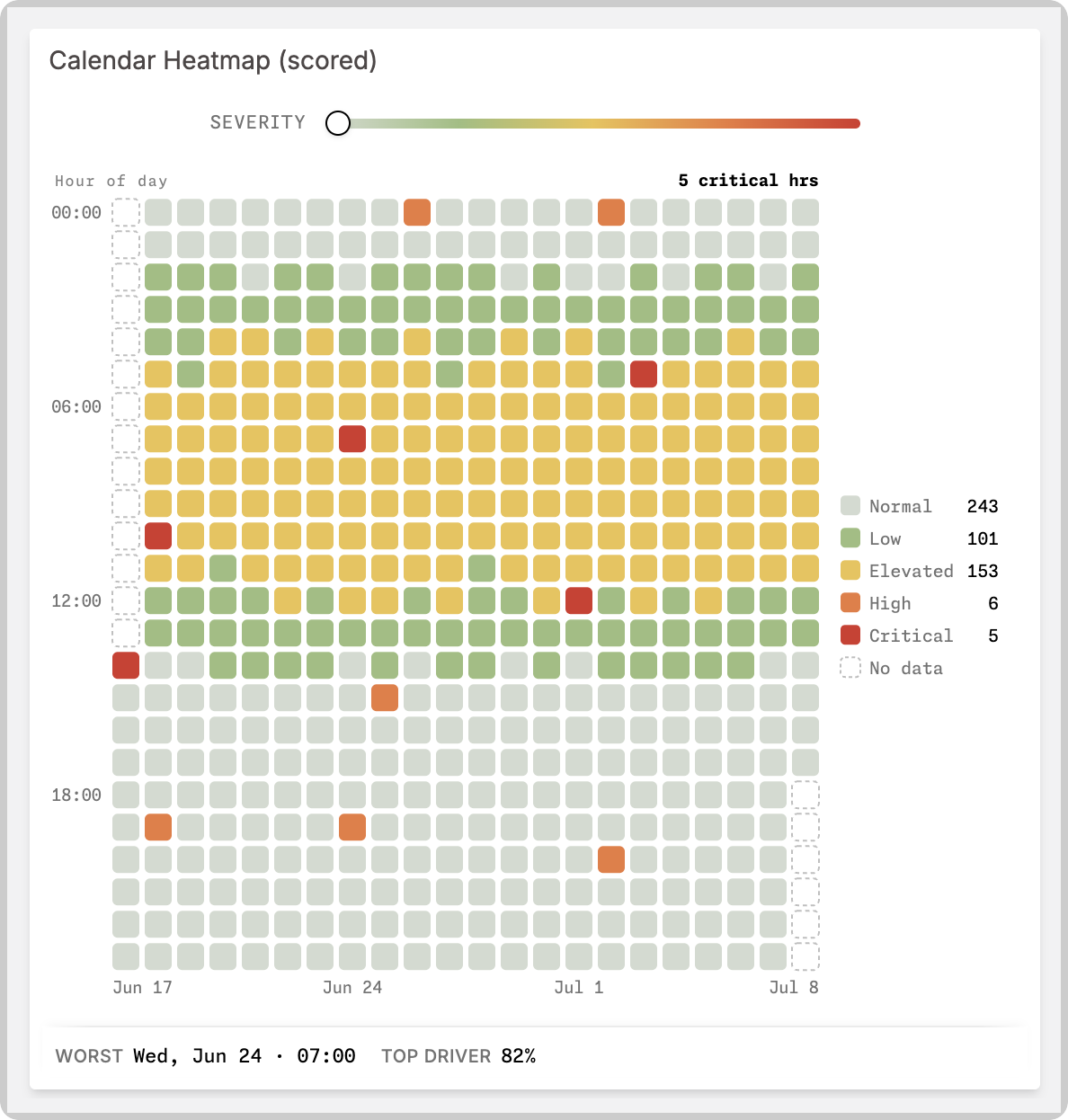
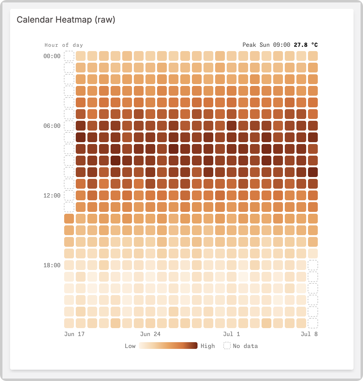
The widget reads two kinds of data, chosen by a configuration toggle:
- Raw values: regular sensor telemetry. The widget buckets and aggregates the records and scales the colors to your data automatically.
- Pre-scored values: anomaly scores from 0 to 1, produced by your own Analysis scripts or another scoring pipeline. The color scale locks to the 0 to 1 range and the widget gains anomaly-specific features: severity tiers, expected ranges, and contributor breakdowns.
Data source
The widget uses exactly one variable. From the Data Sources option, select the device and the variable that holds the data. On Blueprint dashboards, add the Blueprint device and type the variable name.
The widget fetches data over a configurable time window of 1, 2, 4, or 8 weeks (Time window, default 4 weeks).
Data interpretation
The Data interpretation section controls how records become cells.
- Values are pre-scored (0-1): enable when the variable already holds anomaly scores between 0 and 1. Disable to aggregate raw sensor values.
- Aggregation: how multiple records inside the same cell combine: Average, Minimum, Maximum, Sum, Count, Last, or 95th percentile. Raw mode defaults to Average; pre-scored mode defaults to Maximum, so a single bad hour is never averaged away.
- Scale minimum / maximum (raw mode only): clamp the color scale instead of auto-scaling to your data's range.
- Max data points: how many records to fetch before bucketing. Leave empty to fetch the maximum your profile allows; raise it for long windows with frequent data to avoid truncation.
Raw data format
Raw mode reads plain telemetry. No metadata is required:
{
  "variable": "temperature",
  "value": 25.94,
  "unit": "°C",
  "time": "2026-07-08T14:00:00.000Z"
}
value must be numeric and time must be a valid timestamp; records failing either are ignored. The first record with a unit sets the unit shown in cells and tooltips.
Pre-scored data format
In pre-scored mode, value is the anomaly score from 0 (normal) to 1 (critical), and time marks the start of the scored interval. Everything else is optional metadata that enriches the cell's hover card:
{
  "variable": "anomaly_score",
  "value": 0.87,
  "unit": "°C",
  "time": "2026-07-08T14:00:00.000Z",
  "metadata": {
    "severity": "critical",
    "observed": 25.94,
    "expected_min": 22.55,
    "expected_max": 26.55,
    "contributors": [{ "variable": "temperature", "weight": 0.82 }]
  }
}
| Metadata key | Type | What it does |
|---|---|---|
severity | "normal", "low", "elevated", "warning", "high", or "critical" | Overrides the tier derived from the score, affecting the cell color, the tier word in the hover card, and the summary counts. |
observed | number, in the source units | Shows an "Observed" row in the hover card, formatted with the record's unit. |
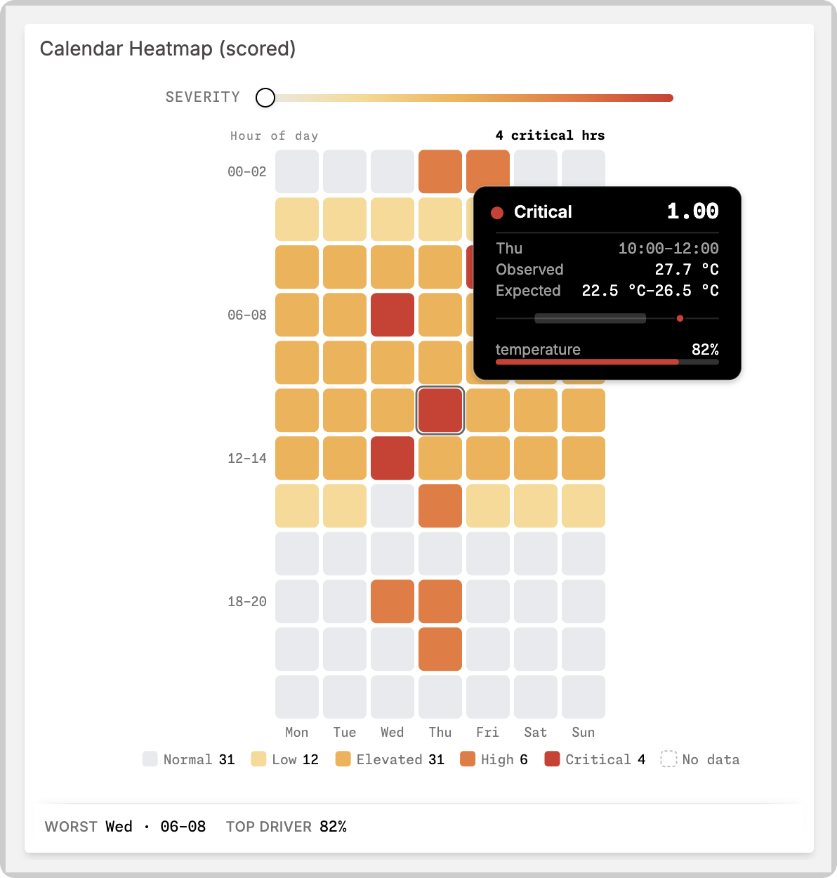
expected_min / expected_max | numbers, in the source units (send both) | Shows an "Expected" range row. When observed is also present, the hover card draws a small sparkline of the observed value against the expected band. |
contributors | array of { "variable": string, "weight": number }, weight from 0 to 1 | Shows the top contributing variables as bars in the hover card. The single highest contributor weight across the grid appears as the "Top driver" percentage in the anomaly summary. |
The severity scale has five tiers; warning and high both map to the High tier, so sending severity: "warning" shows the "High" tier word and color.
Extra lineage keys such as model_id, model_version, run_id, and interval are accepted and ignored by the widget, so you can keep provenance on your scored records.
When several records fall into one cell, the metadata shown comes from the record the aggregation selected. Selecting aggregations (Maximum, Minimum, Last, 95th percentile) carry the chosen record's metadata; averaging aggregations (Average, Sum, Count) only show metadata when the cell holds a single record.
Visualization options
The Visualization section controls the grid's look:
- Palette: Traffic, Neutral alarm, Heat, or Color-blind safe. Tier palettes color cells in five discrete severity steps; the Heat palette is a continuous gradient.
- Grid mode: Daily (one column per day), Day of week (columns Mon through Sun), or Weekly (one column per week).
- Hour bin: group rows into 1, 2, or 3-hour blocks.
- Week starts on: Monday or Sunday.
- Density: Comfortable, Compact, or Chunky cell sizing.
- Legend: place the legend on any side of the grid or hide it, with start, center, or end alignment.
- No-data cell style: how empty cells render (dashed, hollow, hatch, or dot).
- Show header stat: adds a headline stat above the grid, either the peak cell or the count of critical hours.
- Show anomaly summary (pre-scored mode only): adds a footer highlighting the worst cell and the top driver's contribution as a percentage. Per-tier cell counts render in the legend by default, moving into the footer only when the legend is hidden or the Heat palette is used.
The widget colors itself from its own palette and the widget's background, so it renders consistently on the Admin, on TagoRUN, and when embedded, including on custom widget background colors.
Severity filter
Enable Show severity filter to viewers to give dashboard viewers a slider that hides cells below a chosen severity floor, letting them focus on the worst hours. The Severity filter start value sets where the slider starts; with the slider hidden, the same value acts as a fixed floor. The filter is a viewing aid: it never changes stored data, and reloading the dashboard resets it to the configured start value.
Interacting with the grid
Hovering a cell shows a detail card with the value or score, the date and hour range, and, in pre-scored mode, the severity tier plus any metadata extras (observed value, expected range, contributors). Click a cell to pin its card while you compare it against others; press Escape or click elsewhere to unpin. The grid is keyboard accessible: focus it and use the arrow keys to move between cells, Enter or Space to pin, and Escape to unpin.
Custom text
The Custom text option overrides the widget's built-in labels, such as severity tier names, legend text, and hover card rows. Each field accepts a literal string or a dictionary expression like #NS.KEY#, which resolves per language through the TagoRUN dictionary.
Timezone
Cells bucket by hour, so the timezone matters: the Timezone section sets which timezone the grid uses to place records into days and hours. It defaults to your account timezone.