Time Bands & Value Bands
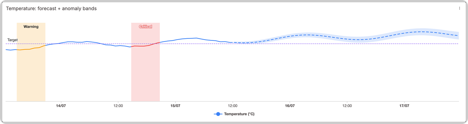
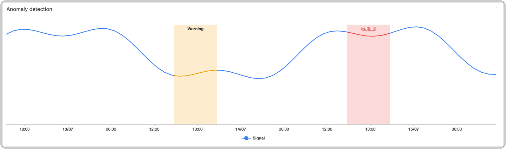
Chart bands shade regions of a chart based on data from one of your variables. They are useful for marking anomaly windows, operating zones, alert thresholds, or any range worth calling out visually:
- Time bands shade windows along the X-axis, spanning the chart's full height. Use them to highlight when something happened, like an anomaly detected between 8:00 and 9:30.
- Value bands shade zones along the Y-axis, spanning the chart's full width. Use them to highlight value ranges, like a "Hot" zone between 30 and 40 degrees.
Both are driven by data: you point the band at a device variable, and the records of that variable define where the bands sit, their colors, and their labels. Writing new records moves the bands, with no widget edit needed. This pairs naturally with anomaly detection or scoring pipelines built on Analysis, which can write band records as they detect events.
Supported widgets
The Line Chart widget supports both band types.
Adding bands to your chart
In the widget's edit page, use the Anomaly time bands and Anomaly value bands sections. Each accepts one band configuration per widget:
- Select the Device (or Blueprint device) and the Variable that holds the band records.
- Optionally set Points (how many of the variable's latest records to read; defaults to the widget's max points) and the Shade opacity.
- For value bands on charts with multiple Y-axes, pick which Axis the zone belongs to. "Default axis" applies it to all series.
Bands always read the latest records of the variable, regardless of the chart's visible time range, so a band defined last week still shades this week's chart.
Time bands
Each record of the band variable draws one shaded window. The window bounds, color, and label come from the record's metadata:
{
  "variable": "anomaly_windows",
  "value": 87,
  "time": "2026-07-10T12:00:00.000Z",
  "metadata": {
    "start_date": "2026-07-10T08:00:00.000Z",
    "end_date": "2026-07-10T09:30:00.000Z",
    "color": "#F43F5E",
    "label": "Anomaly",
    "recolor": true
  }
}
start_dateandend_dateare ISO 8601 dates. Omit either one for an open-ended band that extends to the chart's edge. A record with neither is skipped.colorfills the band andlabelnames it inside the chart.recolor: truealso repaints the metric lines inside the window with the band's color, making the affected stretch of the series stand out. Recolor applies to every series on the chart; a specific variable can keep its own color by enabling its Skip anomaly-band recolor option in the data source settings.- A record that resolves no color (no
metadata.colorand no matching threshold condition) is skipped.
Threshold conditions
Instead of hardcoding a color on every record, a time band can derive its color and label from the record's numeric value (a score). Open the band's Thresholds drawer and define rules, each with a condition, a comparison value, a color, and a label:
| Condition | Meaning |
|---|---|
< | Less than |
> | Greater than |
= | Equal |
! | Not equal |
>< | Between (inclusive) |
* | Anything (catch-all) |
The first matching rule, in the order listed, sets the band's color and label. When a record carries its own metadata.color or metadata.label, those win over the matched rule. A record whose value is not numeric only matches a * rule.
In the example above, a rule like "Greater than 80 = red, 'Anomaly'" colors the window from the score of 87 without any color in the record's metadata.
Value bands
Each distinct zone comes from a record of the band variable. The zone bounds are plain numbers on the Y-axis:
{
  "variable": "temperature_zones",
  "value": 0,
  "time": "2026-07-10T12:00:00.000Z",
  "metadata": {
    "limit_inferior": 30,
    "limit_superior": 40,
    "color": "#F97316",
    "label": "Hot",
    "recolor": true
  }
}
limit_inferiorandlimit_superiorset the zone's lower and upper bound. Omit either for an open-ended zone that extends to the axis edge. A record with neither is skipped.coloris required; a record without it is skipped.labelnames the zone.recolor: truerepaints the parts of the series that fall inside the zone. On charts with multiple Y-axes, recolor only affects series bound to the band's configured axis.- The record's
valueis not used. - Records with the same pair of bounds update the same zone, latest record wins, so you can move or recolor a zone by writing a new record. Records with different bounds draw separate zones.
Composing with other features
Bands compose with Reference Lines and the Line Chart's forecast feature on the same chart: a single widget can show a forecast projection, an alert threshold line, a shaded operating zone, and highlighted anomaly windows at once.