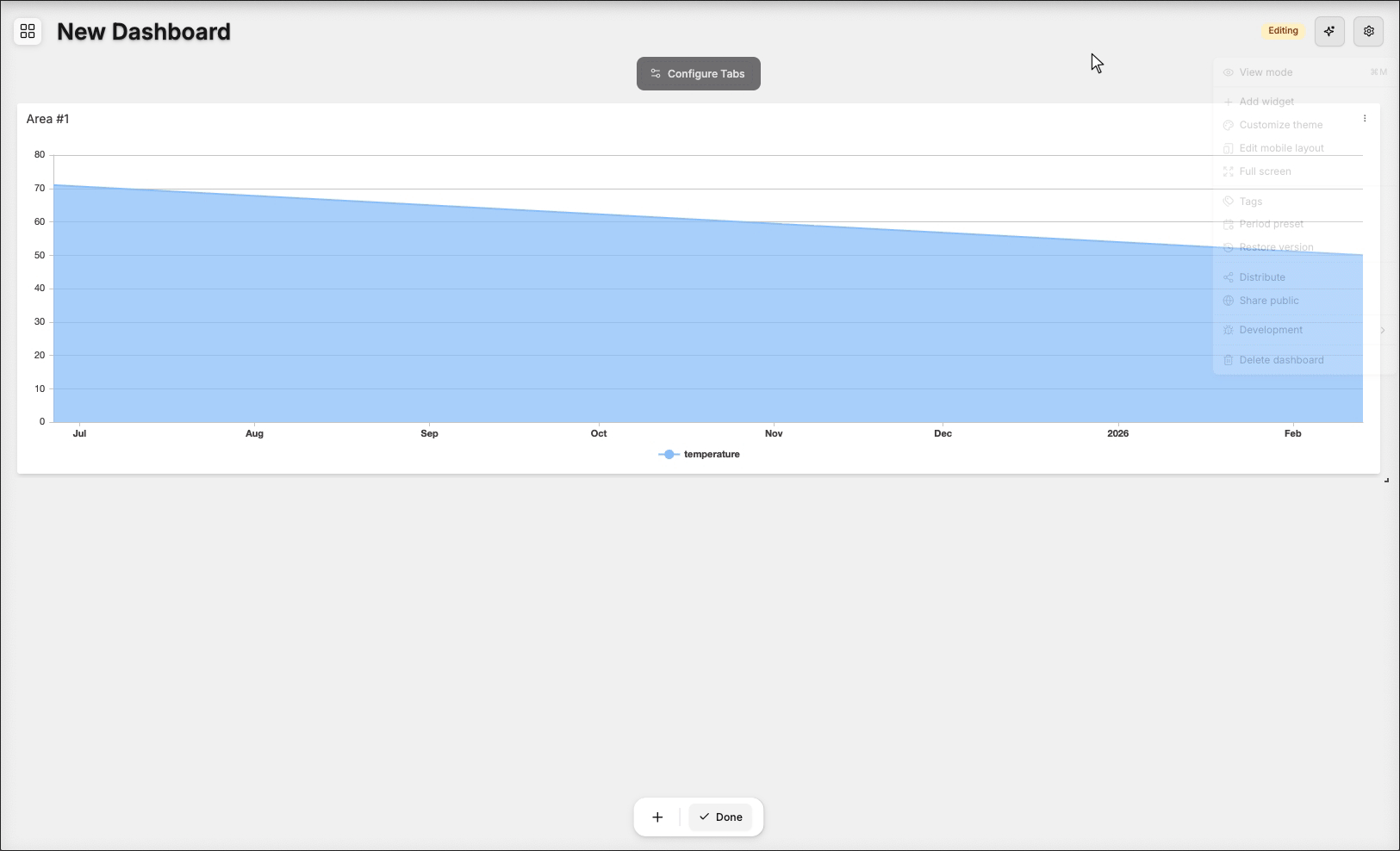
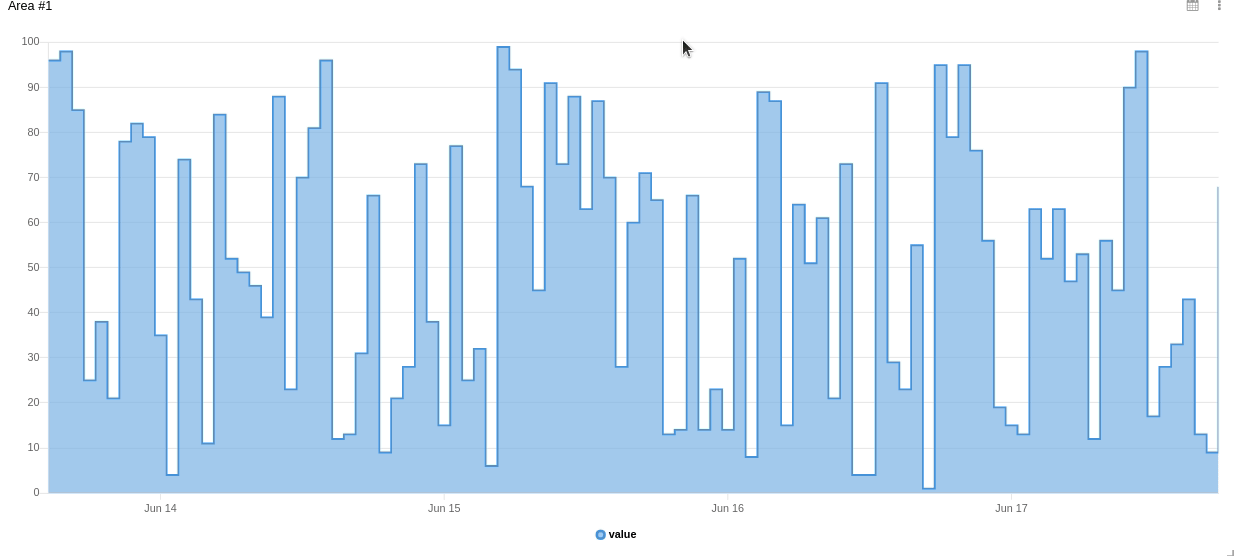
Area Chart Widget
Charts are a powerful way to visualize your data and discover insights. The Area Chart widget supports color customization, applying Formula, and customizing the line shape (step or smooth), among other options.
This widget also accepts features like metadata and groups, which can be set in your variable data.
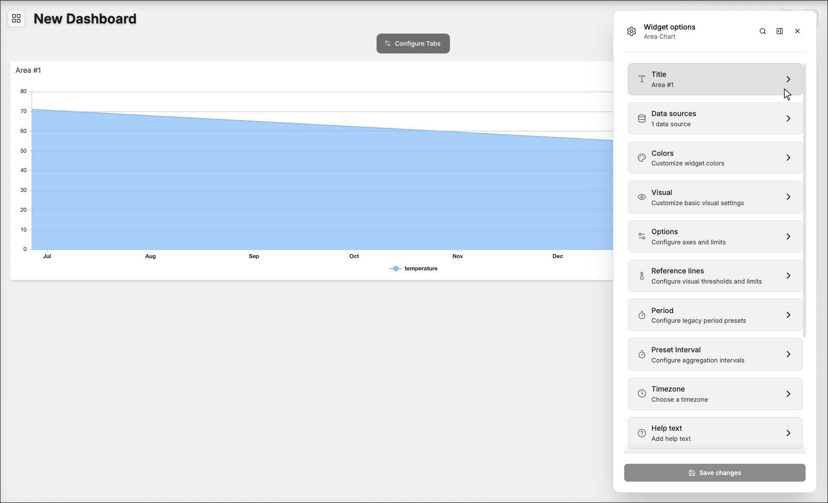
1. 'Data Sources' Field
This field allows you to set the device and variable that will be used by this widget.
1.1 'Data Sources' for Normal Dashboards
From the option 'Data Sources' on the right menu, select one device from your list of devices and the variable that contains the data.

Click on the Settings icon to edit specific options for this variable, such as formulas, color, and more. Click on the close icon to remove this variable from the widget's data.
1.2 'Data Sources' for Blueprint Dashboards
From the option 'Data Sources' on the right menu, add the Blueprint device and input the name of the variable that contains the information.
When using a Blueprint dashboard, the field Variable will list variables to be picked using the currently selected blueprint device.
2. Composing X-axis and Y-axis
In the area chart widget, it is possible to customize how the data will be displayed in the horizontal and vertical axis.
2.1 X-axis
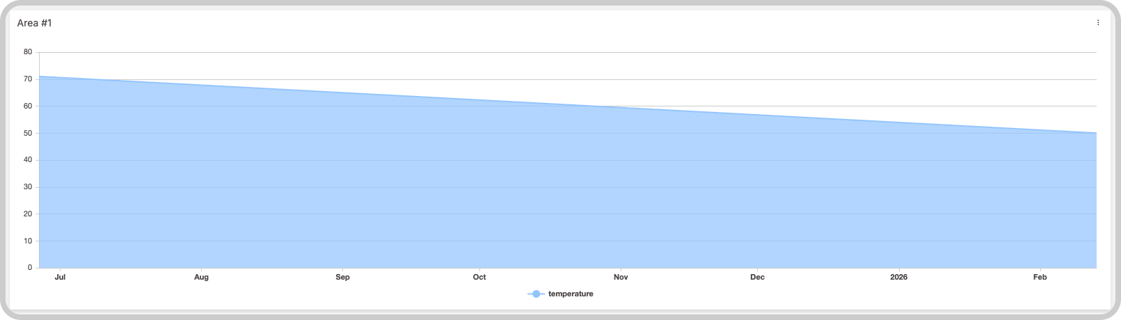
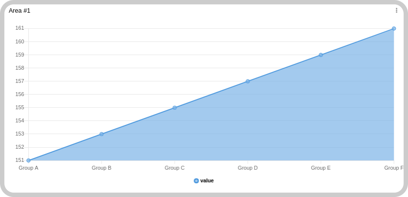
By default, the X‑axis of the chart will be the time of the values, and you can customize the range of time. If you need to group your data through the X‑axis even if they don't have the same time, select a variable that contains the group; all data will then be grouped by groups.
Data is ordered by time ascending, but it is possible to change it to groups:
It is also possible to define the X‑axis time range dynamically, using another variable data. The variable payload should look like this:
{
  "variable": "time_range",
  "value": "Any value",
  "metadata": {
    "start_date": "2021-06-17T00:00:00.000Z",
    "end_date": "2021-06-18T00:00:00.000Z"
  }
}
The start_date specifies the start of the range, and the end_date specifies the end of the range. In this case, the date and format should be in ISO 8601.
2.2 Y-axis
The Y‑axis will automatically find the best scale for your data; it is not necessary to customize it unless you want to do so.
3. Filtering data
It is possible to pre‑set some date filters to be displayed, and these filters can be in minutes, hours, days, weeks, months, or custom by choosing a date in the calendar.
4. Increasing performance
For charts with a large number of data points, enable the Aggregate feature to improve widget performance and make the data easier to visualize. Learn more about the Aggregate feature.