Keypad Visualization
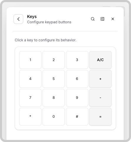
The Keypad widget displays a numeric keypad with digits 0–9, as well as an asterisk (*) and number sign (#), just like a traditional telephone keypad.
You can further tailor the keypad to your application by adding custom buttons in addition to the standard digits.
Button Configuration
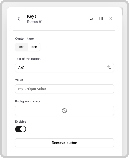
You can create and configure extra buttons to appear alongside the keypad digits. Button configuration options appear in the widget settings (accessible via the widget editor). In each button configuration, you have some options to customize the visuals and functionality of your button.
- Content type: The type of content that will be inside of the button. You can put text here or simply an icon.
- Value: This is the value that will be sent to the device or analysis when a user submits the keypad. Learn more about Keypad's Data Manipulation.
- Background color: The color of the button's background. The font color will be automatically adjusted to either black or white for a better contrast with your color.
- Enabled: Indicates if the button is enabled or not. Disabled buttons cannot be clicked.
- Remove Button: If you click this option, this button will be removed from the keypad. You can still create another button in the same slot as this one.
Something missing from this page?